Colorado Mesa University (CMU) recently changed its old River and Mesa logo to its athletics interlocking letter logo. The Mav head has been moved to the athletics logo. This change is so-so. It leaves a lot to be desired, but the old logo wasn’t the best.
Previously, they made the change from Mesa State College to Colorado Mesa University. During this rebrand, they got community feedback to make the logo better than the old Mesa State logo. They made the design, incorporating the mesa, a river and the new word mark “Colorado Mesa University.” This logo incorporated elements from Grand Junction while keeping the professionalism of a state college. While the new logo an upgrade from the previous one, isn’t the best either. It’s been under speculation. Which is why I think the logo has been changed.

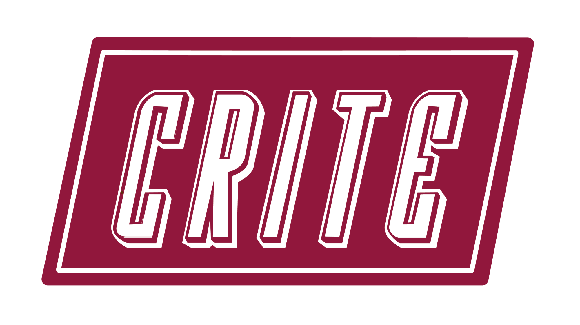
This new interlock letter logo leaves a lot to be desired. The first thing many of us will see is that it reads as “C-U-M” instead of CMU. Because of the M and the U bend on the same weight and level of hierarchy (top and bottom of the letter meet up), it means we can easily read the logo as “C-U-M.” It begs the question: would somebody read the logo CMU without knowing what the college is called? This is a big issue with how the brand is perceived, and do we want to be perceived as the CUM school?
Furthermore, the logo has a stranded stroke around all the letters. This leads to the logo reading funny at small sizes. Along with the slim font size of the interlocking logo, it makes it hard to read at small sizes.
Most state colleges have interlocking letter logos, for example, DU, CU, etc. I wonder if the inspiration behind making this logo the main logo this year is an attempt to brand themselves as a state college like CU and CSU. In this regard, I’m conflicted because, on one hand, I want the school to grow and be a D1 school. However, this also means Mesa can’t be seen as different. I’d like the school to stand out from the competitors, because that’s what makes the school special, as well as make an effort to choose a logo that incorporates the community and what makes Grand Junction special. The interlocking logo does not show any personality about the college like the old one did.
The interlocking logo typeface is a serif font. This helps up stand out from the competition with a serif font choice. I have several problems with the technical side of the typeface used in the logo. For one, the C is a stretched C over all the other letters. The letter C does not fit with the other letters; it looks skewed in proportion to the others. The logos of Denver University (DU) and Colorado University (CU) have cohesive lettering and hierarchy and is not skewed. Typically, a logo and a word mark make up what’s called a signature. In the signature, they use two different typefaces: one for the logo and one for the word mark. This is actually something good. I wish they made it a serif and sans serif, though. I don’t have anything against the word mark it works fine both in a verticle and horizontal format.

